Animated circles are incredibly versatile and extremely easy to create. Let's take a look at the steps at how to create an animated circle.
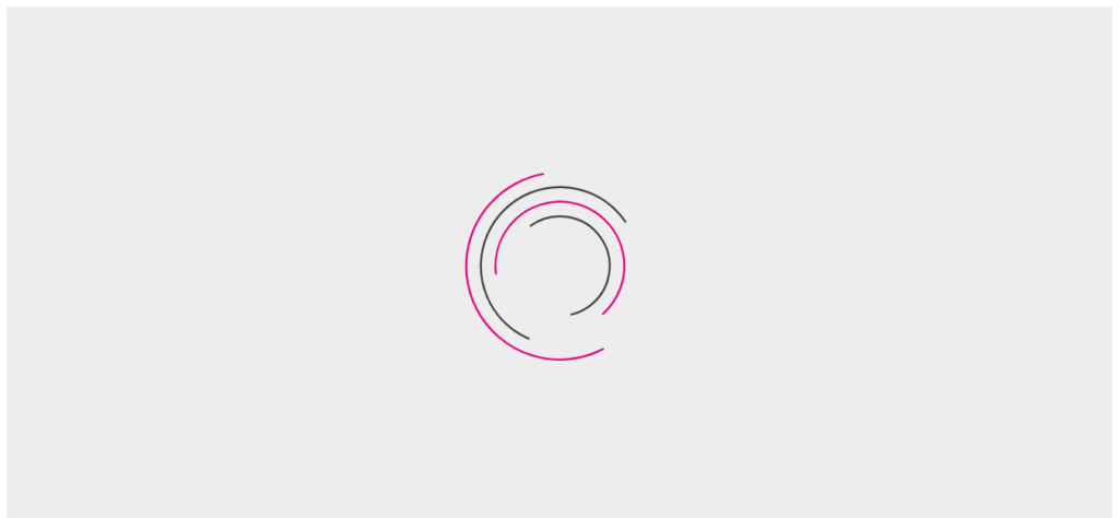
In the example, animated loading icon is created from four circles. The created circles are not filled but have alternative stroke-color.
In CSS structure, nth-of-type selector are used to add a special stroke-dash array to every circle. Further, key frame animation is formed, which rotates the circle by 360 degrees and transformation rotates the circle back to its original position. Also, the animation values are added to the circle, which include,
animation-name: preloader;
animation-duration: 3s;
animation-iteration-count: infinite;
animation-timing-function: ease-in-out;
The unwanted pause in our animation is merely stopped by adding the delays to a negative value.
The final output animates circle successively, which makes the illusion of circles chasing one another.