Boxes are part of every website and considered as a user-friendly way to display more information in a limited space. In this tutorial, you will get to know about ways to create boxes that are designed keeping the appropriate contrast ratio.
To commence with the design create HTML layout and copy it as many times as you wish to have boxes. Sections are created for a container class, service box, title, description and button. Each of the section is designed using CSS. Copy the HTML code.
CSS Structure
Set the basic typography in the body for the entire section. The selector nth-child (even) matches every element that is the nth-child. The title is assigned with the property of light text-shadow, and linear gradient considering applicable contrast ratio. Further, a box-shadow is applied for the effect to change the shadow from an outer shadow to the inner shadow, and for a smooth transition, property ease-out is applied for a given duration.
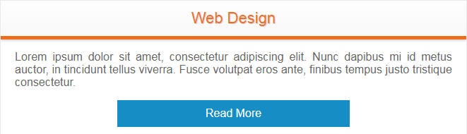
Here is what the final design be like. Adjust the width and height as per your requirements.