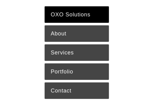
In this tutorial you will learn about the creation of 3D Flip Navigation using HTML and CSS only. The steps are simple to understand, so one can easily customise the navigation in their desired way.
The layout is simple to create. Specific classes are used to style the layout in a particular way. Firstly, to place all the elements in a particular responsive fixed width, the container class is used. Then, the list-item (li) tag is used inside the unordered list (ul) tag to display the menu-list. Further, add the content of the flip sides using class flip-card-content, then, add the name of the page to display on one side and a short description on the flip side to make it look more meaningful. Here flip-card-side-a class is applied for the display of front side content and flip-card-side-b for the other side content.
Structured CSS not only styles the layout but makes it three-dimensional. In the example, the vertical menu is created, therefore, flip-container width 20% is used.
Set the margin and padding of Unordered and list-items. The styling of the list should be none to remove the bullets.
The desired typography for the content class is set besides positioning the div. Foremostly, flip-card-content is applied with the element transform-style to make the element render in 3D space.
There are some properties that are applied to both sides of the card for proper functioning. To position the element relative to its parent, it is necessary to use an absolute position. When an element is rotated, the mirror image of the element appears backface-visibility element hides the other image and all ease transition element is applied for seamless navigation. The transform-origin element sets the point of origin of the transform. In the example, it is positioned default 50% 50% which is the center. All the browser engines are considered in the code to make the properties working on popular web browsers.
Both the cards are transformed at different degrees and axis for perfect rotation of the card.
Hover transitions on one side will be opposite to each other.
Here is how the 3D flip navigation will appear finally.
